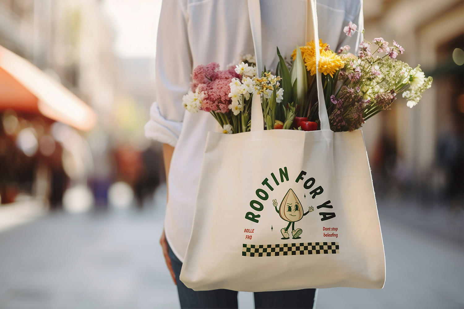
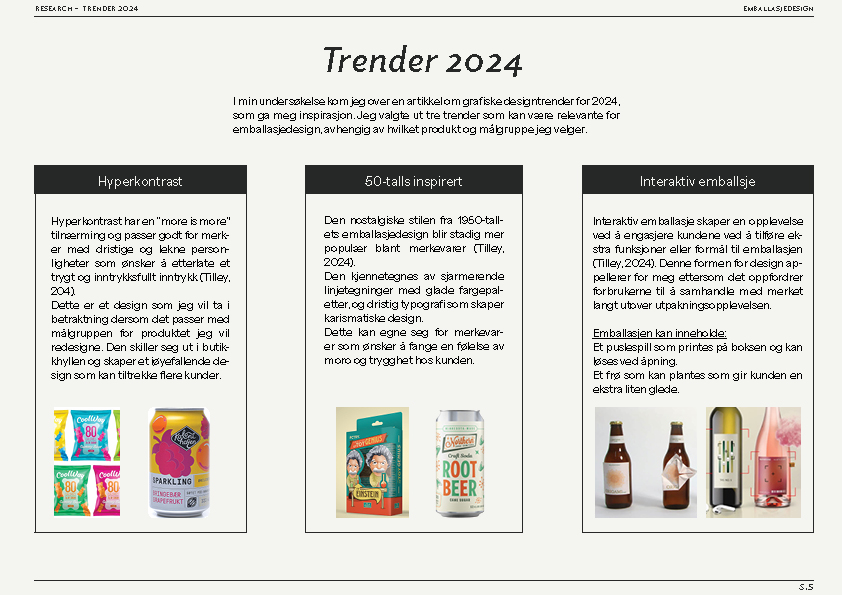
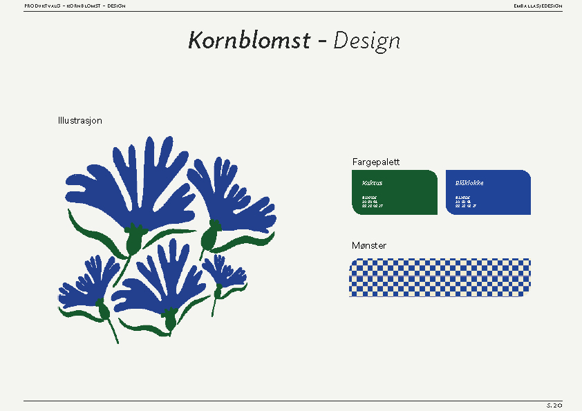
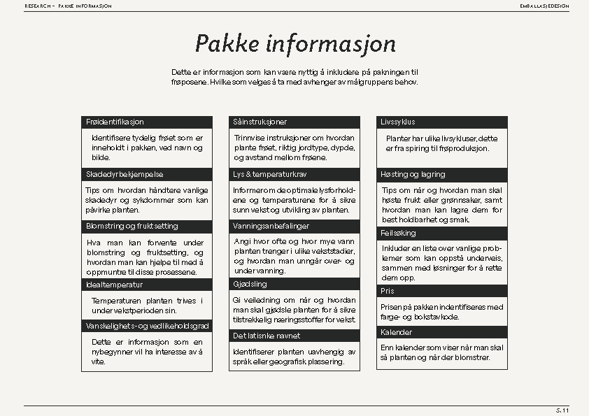
Bøllefrø is a bold and playful seed brand concept designed for beginner gardeners who want to reconnect with nature, without feeling overwhelmed. The name comes from the Norwegian word for a cheeky child, hinting at both mischief & growth, & setting a playful tone for the brand.The concept was developed in response to outdated seed packets that lacked clear instructions & emotional appeal.
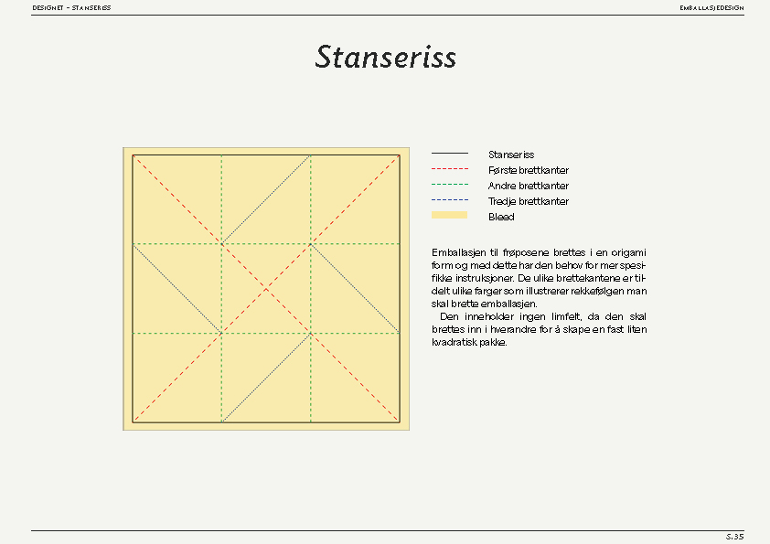
The redesign takes the form of an origami-style envelope with no glue, minimal waste, and 100% recyclable materials. It also creates a unique unboxing experience.Visually, Bøllefrø draws on retro packaging aesthetics with modern twists such as high-contrast color palettes, bold typography, and tactile print finishes. The packet doubles as a care guide, transforming from a simple wrapper into a helpful companion throughout the plant’s life cycle.Bøllefrø challenges the conventions of seed packaging, turning the first step of gardening into an approachable journey.
Bøllefrø began as a response to the cluttered look of traditional seed packets, which often felt confusing to beginner gardeners. I wanted to create packaging that felt approachable, & sustainable, something that turned gardening into a fun, confidence-building experience.
Through research into eco-friendly materials, user interaction, and visual storytelling, I explored how packaging could act as both a guide & a keepsake. The origami-inspired, glue-free structure emerged from this exploration, balancing sustainability with playfulness.
Along the way, I learned how thoughtful form, clear communication, and tactile design can transform something as simple as a seed packet into a memorable, educational experience.


.svg)
